Wednesday, September 15, 2010
Thursday, August 12, 2010
FILM AND ANDY WARHOL
I'm reading a biography on Andy Warhol as I write this and as such have been sort of voraciously researching and needing to see all the things I never knew I needed to see. I've always been sort of indifferent to a lot of his work, understanding that at the time he WAS doing something completely revolutionary with painting. It's just a personal thing, I guess- I'm not big on his colours and the obsession with celebrity- although the idea of consumerism as a subject matter is something I am (clearly?) drawn to.
He is known as being one of the worst filmmakers in history. I agree and disagree. Watch for yourself.
The above 'Screen Tests' were filmed from early '64 through late '66 and were originally conceived as film portraits (I love this and have seen more contemporary takes on it in modern art museums in the recent past)- portraits done on film rather than on canvas. Bob Dylan's piece was highlighted in 'Factory Girl' a few years back, and it has been said that Dylan got up within minutes and left the factory because he was disgusted by Andy's allegedly talentless leaching and worship of consumerism.
It's wild how differently each subject 'handles' their time in front of the camera. Nico seems a bit distracted, perhaps sort of self-conscious, while Lou Reed is the fucking epitome of cool indifference. Sedgwick is such a damaged, beautiful muse. Apparently Warhol also did screen tests with Allen Ginsberg and Donovan, but I can't find them!
I've also got some slices of 'Vinyl' (which you might also recognize from 'Factory Girl') and 'Blow Job Movie' with Gerard Malanga.
An interesting way to watch? Turn all the screen tests on at once. Maybe a little Brady Bunch-y, but way cooler.
xo.s
Wednesday, July 21, 2010
BETH CAVERNER STICHTER


In some ways I know it's a newfound personal appreciation for the animal kingdom, but art and design have DEFINITELY been nodding toward the natural world increasingly over the last few years. Taxidermy. Anthrompomorphic figures. Mountains and forests. Yeah, I know, it's a reaction to modern day life and our worsening obsession with technology. Isn't it always?
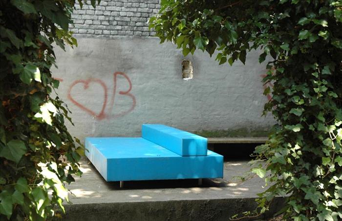
Anyway. These sculptures are stunning, disturbing, and..... white. They may seem to be 'unfinished' in their lack of colour, but I think the palette is meant to draw attention to the material/process (clay) and keep the focus on emotion.
"There are primitive animal instincts lurking in our own depths, waiting for the chance to slide past a conscious moment. The sculptures I create focus on human psychology, stripped of context and rationalization, and articulated through animal and human forms. On the surface, these figures are simply feral and domestic individuals suspended in a moment of tension. Beneath the surface they embody the impacts of aggression, territorial desires, isolation, and pack mentality.
Both human and animal interactions show patterns of intricate, subliminal gestures that betray intent and motivation. The things we leave unsaid are far more important than the words we speak out loud to one another. I have learned to read meaning in subtler signs; a look, the tightening of muscles in the shoulders, the incline of the head, and the slightest unconscious gestures. I rely on animal body language in my work as a metaphor for those underlying patterns, transforming the animal subjects into human psychological portraits"
It continues on, so have a look. Her statement is well done and the site shows the UNBELIEVABLE amount of intricate work involved, with a step-by-step photo journal of her process.
xo.s
Thursday, July 1, 2010

Wednesday, June 30, 2010
SOME NEW WORK BY YOURS TRULY

Copyright Sara Nickleson, 2010.
I'm currently working on some digital collage that will likely become a series of paintings. Super excited.
xo.s
ROLAND TIANGCO'S DIRT POSTER
Parsons student Roland Tiangco's message to the 'information generation' is a clear one; that is, if you're willing to get it dirty. We're full of potential and there's much to be done. Go ahead, get on it.


I should talk.
Point is, this design is clever on so many levels.


xo.s
Friday, May 7, 2010
OWI// OFFICE FOR WORD AND IMAGE


I found this site about an hour ago and only stopped looking long enough to share it with you. If you love interior design, have a gander; BUT I have to stress that I see this so differently than your typical 'interior design' site. These lofts, barns, chateaux (yes, chateaux), and garages-come-living spaces are HOMEY. So homey. Interior work is often done by someone that knows little to nothing about their client. And more often than not, the client has no idea how to express what they really want. Hence, the beige phenomenon. There's nothing more indecisive than beige.
But I digress.
From the site:
"Office for Word and Image// OWI is specialized in full reportages, including text and images on architecture and interiors. We choose amongst the archives of some of the best photographers and journalists for features with a contemporary look and an interesting story. In our selection we aim for top quality photography and exclusive private homes or exceptional public buildings, accompanied by sharp interviews with some of the world's leading architects"
The places on OWI were done by architects and interior designers but it's the clients who know what they want and take an exceptionally active and creative role that make these homes what they are: The story of their lives.
This applies to many resources out there, but I just felt the need to really point it out. Make something. Put old flooring on the walls. Paint your walls and sandblast them. Build a faux brick fireplace and put candles inside. Put those candles inside old bottles. Have fun with it. Don't be scared and you won't regret it.
Unless you like beige.
click click
xo.s
Monday, May 3, 2010
BARBARA KRUGER AT THE AGO


I would normally declare that I saw this on designboom first, but I can proudly say that my initial contact with this piece was in PERSON. I love living in Toronto.
From the boom:
"....a site-specific work by american artist barbara kruger is currently on display along the façade of the art gallery of ontario (AGO) in toronto. the public installation is located on the north facade of the frank gehry designed gallery as part of the contact photography festival. the piece was created by kruger in response to the festival’s theme ‘pervasive influence’. the work consists of a series of found images and statements that includes ‘shove it’, ‘love it’, ‘kiss it’, believe it’ and ‘shame it’. the project aims to explore ‘how photography informs and transforms human behavior, especially via the medium’s connections to mass media, advertising, consumerism, and propaganda.’ the installation will be on show until august 30, 2010"
These photos don't do it justice. I'd include some of mine, but they would do it even less. The lady's aim has always been impact, and impact she has. Kruger is an American Conceptual Artist known for the found black and white imagery she pairs with aggressive/generalized/short'n'sweet accusations on consumer culture, feminism and classicism. Her work leaves the viewer with the feeling of being in a power struggle with the artist, and it never ceases to amaze that Kruger is able to make us want to defend ourselves when we know she's right..... defend ourselves when we feel compelled to rebut that she doesn't 'know' us.... that the work of a single woman can accurately point fingers at SO many. However, let it be known that her work is not to put down, but to educate. To make us look more honestly at ourselves, one another, and the media we quietly consume. Tough love.
I'd like to write more but i'm off to work. check back?
xo.s
Wednesday, March 31, 2010
Ofr.


0fr. Film portraits: Cheri Messerli from Ofr. on Vimeo.
So, I love 'Scout Holiday'; easily one of the most understated and captivating sites I've seen (nay, frequent). Charming charming charming.
Stylist and jewelry designer Cheri Messerli is behind the blog, having relocated with husband and graphic designer David Rager (excavation by spoonfulls) from LA to Paris. Recently posted was the Ofr Paris City Guide that caught my attention, and just today Cheri displayed some lovely shots of her work in the Ofr front window in Paris.
What's Ofr? I wondered, and now you are too. It's actually sort of hard to say. From the site, it appears to be a gallery and beautiful bookstore, hosting pop-up shops all over the world. The space holds shows, which are well-documented on vimeo, promotes artists and musicians and puts out some BEAUTIFUL graphic work- from the Paris Guide (I'd pick it up, anyone planning to go- the photos are gorgeous and doubtless they have hand-picked best places to visit) to their series of postcards.
Above, some of the shop's offerings, as well as a closeup of Cheri and her work. Isn't she lovely?
click click
xo.s
Subscribe to:
Posts (Atom)