Friday, May 7, 2010
OWI// OFFICE FOR WORD AND IMAGE
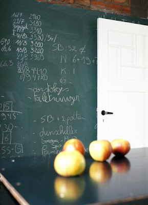
I found this site about an hour ago and only stopped looking long enough to share it with you. If you love interior design, have a gander; BUT I have to stress that I see this so differently than your typical 'interior design' site. These lofts, barns, chateaux (yes, chateaux), and garages-come-living spaces are HOMEY. So homey. Interior work is often done by someone that knows little to nothing about their client. And more often than not, the client has no idea how to express what they really want. Hence, the beige phenomenon. There's nothing more indecisive than beige.
But I digress.
From the site:
"Office for Word and Image// OWI is specialized in full reportages, including text and images on architecture and interiors. We choose amongst the archives of some of the best photographers and journalists for features with a contemporary look and an interesting story. In our selection we aim for top quality photography and exclusive private homes or exceptional public buildings, accompanied by sharp interviews with some of the world's leading architects"
The places on OWI were done by architects and interior designers but it's the clients who know what they want and take an exceptionally active and creative role that make these homes what they are: The story of their lives.
This applies to many resources out there, but I just felt the need to really point it out. Make something. Put old flooring on the walls. Paint your walls and sandblast them. Build a faux brick fireplace and put candles inside. Put those candles inside old bottles. Have fun with it. Don't be scared and you won't regret it.
Unless you like beige.
click click
xo.s
Labels:
architecture,
furniture,
interior design,
photography,
website,
workspace/studio
Monday, May 3, 2010
BARBARA KRUGER AT THE AGO
I would normally declare that I saw this on designboom first, but I can proudly say that my initial contact with this piece was in PERSON. I love living in Toronto.
From the boom:
"....a site-specific work by american artist barbara kruger is currently on display along the façade of the art gallery of ontario (AGO) in toronto. the public installation is located on the north facade of the frank gehry designed gallery as part of the contact photography festival. the piece was created by kruger in response to the festival’s theme ‘pervasive influence’. the work consists of a series of found images and statements that includes ‘shove it’, ‘love it’, ‘kiss it’, believe it’ and ‘shame it’. the project aims to explore ‘how photography informs and transforms human behavior, especially via the medium’s connections to mass media, advertising, consumerism, and propaganda.’ the installation will be on show until august 30, 2010"
These photos don't do it justice. I'd include some of mine, but they would do it even less. The lady's aim has always been impact, and impact she has. Kruger is an American Conceptual Artist known for the found black and white imagery she pairs with aggressive/generalized/short'n'sweet accusations on consumer culture, feminism and classicism. Her work leaves the viewer with the feeling of being in a power struggle with the artist, and it never ceases to amaze that Kruger is able to make us want to defend ourselves when we know she's right..... defend ourselves when we feel compelled to rebut that she doesn't 'know' us.... that the work of a single woman can accurately point fingers at SO many. However, let it be known that her work is not to put down, but to educate. To make us look more honestly at ourselves, one another, and the media we quietly consume. Tough love.
I'd like to write more but i'm off to work. check back?
xo.s
Subscribe to:
Comments (Atom)


