THE NEW BLACK
art.design.inbetween
Wednesday, March 23, 2011
CLAIRE PESTAILLE
Hi.
It's been a long time. I don't know why, really.... been busy working, a bit disillusioned and trying to figure it all out. The last year has been sort of a creative crisis, but I'm working on it. I promise.
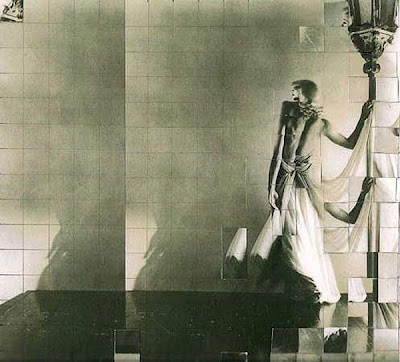
I'm out of practice in posting, so I'll quote a source that knows what it's talking about. I just think these are so beautiful. And geometric. And old-timey.
Saatchi Online says:
"The Crystal Time series depicts images of women taken from found photographs from the 1920's. The found image has been photocopied twice, divided, squared and cut. The replicated image is reassembled within the format of a grid or view finder multiplying and removing contents from the original in order to produce a fractured circuit or a simultaneous double. Crystal Time (Loretta) is a dream image or a recollection image where there becomes a cross over or blurring of actual and virtual, past and present, where the real and imaginary exist within the same world."
I've missed this.
xo.s
Wednesday, September 15, 2010
Thursday, August 12, 2010
FILM AND ANDY WARHOL
I'm reading a biography on Andy Warhol as I write this and as such have been sort of voraciously researching and needing to see all the things I never knew I needed to see. I've always been sort of indifferent to a lot of his work, understanding that at the time he WAS doing something completely revolutionary with painting. It's just a personal thing, I guess- I'm not big on his colours and the obsession with celebrity- although the idea of consumerism as a subject matter is something I am (clearly?) drawn to.
He is known as being one of the worst filmmakers in history. I agree and disagree. Watch for yourself.
The above 'Screen Tests' were filmed from early '64 through late '66 and were originally conceived as film portraits (I love this and have seen more contemporary takes on it in modern art museums in the recent past)- portraits done on film rather than on canvas. Bob Dylan's piece was highlighted in 'Factory Girl' a few years back, and it has been said that Dylan got up within minutes and left the factory because he was disgusted by Andy's allegedly talentless leaching and worship of consumerism.
It's wild how differently each subject 'handles' their time in front of the camera. Nico seems a bit distracted, perhaps sort of self-conscious, while Lou Reed is the fucking epitome of cool indifference. Sedgwick is such a damaged, beautiful muse. Apparently Warhol also did screen tests with Allen Ginsberg and Donovan, but I can't find them!
I've also got some slices of 'Vinyl' (which you might also recognize from 'Factory Girl') and 'Blow Job Movie' with Gerard Malanga.
An interesting way to watch? Turn all the screen tests on at once. Maybe a little Brady Bunch-y, but way cooler.
xo.s
Labels:
1960s,
conceptual,
film,
fine art,
music,
quotes,
video,
workspace/studio
Wednesday, July 21, 2010
BETH CAVERNER STICHTER
In some ways I know it's a newfound personal appreciation for the animal kingdom, but art and design have DEFINITELY been nodding toward the natural world increasingly over the last few years. Taxidermy. Anthrompomorphic figures. Mountains and forests. Yeah, I know, it's a reaction to modern day life and our worsening obsession with technology. Isn't it always?
Anyway. These sculptures are stunning, disturbing, and..... white. They may seem to be 'unfinished' in their lack of colour, but I think the palette is meant to draw attention to the material/process (clay) and keep the focus on emotion.
"There are primitive animal instincts lurking in our own depths, waiting for the chance to slide past a conscious moment. The sculptures I create focus on human psychology, stripped of context and rationalization, and articulated through animal and human forms. On the surface, these figures are simply feral and domestic individuals suspended in a moment of tension. Beneath the surface they embody the impacts of aggression, territorial desires, isolation, and pack mentality.
Both human and animal interactions show patterns of intricate, subliminal gestures that betray intent and motivation. The things we leave unsaid are far more important than the words we speak out loud to one another. I have learned to read meaning in subtler signs; a look, the tightening of muscles in the shoulders, the incline of the head, and the slightest unconscious gestures. I rely on animal body language in my work as a metaphor for those underlying patterns, transforming the animal subjects into human psychological portraits"
It continues on, so have a look. Her statement is well done and the site shows the UNBELIEVABLE amount of intricate work involved, with a step-by-step photo journal of her process.
xo.s
Thursday, July 1, 2010
Wednesday, June 30, 2010
SOME NEW WORK BY YOURS TRULY
Copyright Sara Nickleson, 2010.
I'm currently working on some digital collage that will likely become a series of paintings. Super excited.
xo.s
Labels:
colour,
conceptual,
graphic design,
illustration,
painting,
support me:)
ROLAND TIANGCO'S DIRT POSTER
Parsons student Roland Tiangco's message to the 'information generation' is a clear one; that is, if you're willing to get it dirty. We're full of potential and there's much to be done. Go ahead, get on it.
I should talk.
Point is, this design is clever on so many levels.
xo.s
Labels:
blog,
conceptual,
graphic design,
materials,
student work,
typography
Friday, May 7, 2010
OWI// OFFICE FOR WORD AND IMAGE
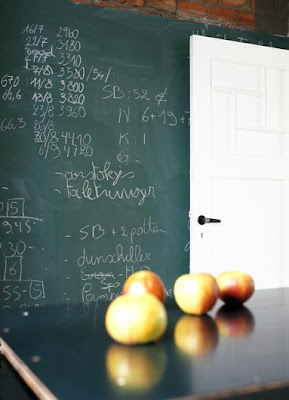
I found this site about an hour ago and only stopped looking long enough to share it with you. If you love interior design, have a gander; BUT I have to stress that I see this so differently than your typical 'interior design' site. These lofts, barns, chateaux (yes, chateaux), and garages-come-living spaces are HOMEY. So homey. Interior work is often done by someone that knows little to nothing about their client. And more often than not, the client has no idea how to express what they really want. Hence, the beige phenomenon. There's nothing more indecisive than beige.
But I digress.
From the site:
"Office for Word and Image// OWI is specialized in full reportages, including text and images on architecture and interiors. We choose amongst the archives of some of the best photographers and journalists for features with a contemporary look and an interesting story. In our selection we aim for top quality photography and exclusive private homes or exceptional public buildings, accompanied by sharp interviews with some of the world's leading architects"
The places on OWI were done by architects and interior designers but it's the clients who know what they want and take an exceptionally active and creative role that make these homes what they are: The story of their lives.
This applies to many resources out there, but I just felt the need to really point it out. Make something. Put old flooring on the walls. Paint your walls and sandblast them. Build a faux brick fireplace and put candles inside. Put those candles inside old bottles. Have fun with it. Don't be scared and you won't regret it.
Unless you like beige.
click click
xo.s
Labels:
architecture,
furniture,
interior design,
photography,
website,
workspace/studio
Subscribe to:
Posts (Atom)


