Showing posts with label colour. Show all posts

Wednesday, June 30, 2010

SOME NEW WORK BY YOURS TRULY

Copyright Sara Nickleson, 2010.

I'm currently working on some digital collage that will likely become a series of paintings. Super excited.

xo.s

Wednesday, March 31, 2010

Ofr.


0fr. Film portraits: Cheri Messerli from Ofr. on Vimeo.

So, I love 'Scout Holiday'; easily one of the most understated and captivating sites I've seen (nay, frequent). Charming charming charming.
Stylist and jewelry designer Cheri Messerli is behind the blog, having relocated with husband and graphic designer David Rager (excavation by spoonfulls) from LA to Paris. Recently posted was the Ofr Paris City Guide that caught my attention, and just today Cheri displayed some lovely shots of her work in the Ofr front window in Paris.

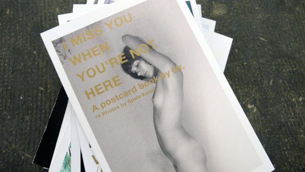
What's Ofr? I wondered, and now you are too. It's actually sort of hard to say. From the site, it appears to be a gallery and beautiful bookstore, hosting pop-up shops all over the world. The space holds shows, which are well-documented on vimeo, promotes artists and musicians and puts out some BEAUTIFUL graphic work- from the Paris Guide (I'd pick it up, anyone planning to go- the photos are gorgeous and doubtless they have hand-picked best places to visit) to their series of postcards.

Above, some of the shop's offerings, as well as a closeup of Cheri and her work.  Isn't she lovely?

click click

xo.s


Wednesday, February 17, 2010

SANTIAGO YDANEZ


David Delfin and Gorka Postigo; collectors of Ydanez' work, in their home


I stumbled across the work of Santiago Ydanez very recently and haven't stopped staring. I have always been especially fond of portraiture for the obvious reasons: its ability to convey an acute and wide variety of human emotions; conveyance of striking realism or shocking mutation as seen in expressionist work; and always the intense reading of the EYES.

Ydanez works on 200cm canvases with minimalist colouring. Many of his pieces are done with more variation in hue, but I've chosen the above to showcase because I LOVE the strong contrast in his use of black and white.

What's most intriguing is his brushstroke; his work leans toward expressionism in its wild application of paint, however, it is evident that there is extreme calculation in his gestures. His portraits are not born of improvisation or of loose emotional abandon, but of painting used as an instrument and not an aim unto itself. It is an extremely successful pairing of opposite schools of thought.

While researching Ydanez I came across one of the reference images he had shot himself for one of his many 'untitled' works (top). He covers his subjects' faces in everything from (what looks to be) food colouring to whipped cream before photographing their screaming, twisted visages.

It's brilliant. So powerful. Be sure to have a look at the gallery video!

click click

xo.s

Friday, February 5, 2010

THAT'S NICE


Back in April I did an iPhoto mashup-type post that I'm feeling again today. Enjoy.

xo.s

Monday, November 16, 2009

INK CALENDAR BY OSCAR DIAZ


"The 'Ink Calendar' makes use of the timed pace of the ink spreading on the paper to indicate time. The ink is absorbed slowly, and the numbers in the calendar are 'printed' daily. One a day, they are filled with ink until the end of the month. The calendar enhances the perception of time passing and not only signaling it. The aim of the project is to address our senses, rather than the logical and conscious brain"

The ink colour is different for every month and is based on a spectrum that follows a temperature scale; each new page utilizes a colour that relates to our sensory perception of that particular month. 

Wild.


xo.s

Friday, June 19, 2009

SARAH SPITLER


Just found San Francisco artist Sarah Spitler on the site 20x200, where you can buy prints for as low as $20! Check out her work and have a look through 20x200, where the theory is that there are thousands of artists that want to sell their prints.... mass quantities at low prices over the internet gets their names out and helps them make a profit!

You could fill your empty walls for one or two hundred bucks, China! (told you I'd keep my eye out... xo)


xo.s

Monday, April 13, 2009

LIFE IN PANTONE


Heavy into school, so I'll quote:

from designboom:

"While the pantone colour palette has inspired many a design, designboom has observed the idea of transferring reality into pantone colours.  Canadian designer Todd Falkowsky created pantone palettes for the major cities in the country.  The colours are taken from natural locations such as rivers and creeks as well as cultural or man-made things like hockey uniforms or public transportation.  Across the pond, English designer Alice Wang created a series titled 'Parktone' which took colour samples of grass in some of England's parks.  She even developed a grass scanner to generate colour samples.  While it is hard to say what this reality to pantone trend represents, it definitely gives new appreciation for the colours that we take for granted"

Falkowsky is a prof at OCAD and has designed for Target, among others; Some of his work can be found here 

xo.s

Monday, February 16, 2009

LIZ WOLFE


So sleepy.

From designboom:
"While her work appears bright and colourful, little touches hint at the subversiveness below the surface.  The subjects in her work are still lives created using plasticine, flowers, cakes and other props"

Liz is a TORONTO BASED photographer (yay) that just closed a show at the Gladstone Hotel on Queen West on February 8th.  I love how multi-dimensional her work is.  It's gorgeous and bright, but also so subtly twisted.  An inspired contrast!

'Breasts', 2008
'Yellow Shoes and Sardines', 2004
'Cakes' and 'Butterflies on Wounded Cake', 2008
'Red Shoes' and 'Tampon', 2008
'Popsicle' and 'Cupcakes', 2008
'Bunny with Candy', 2008

LinkWithin

Related Posts with Thumbnails